ISSUE 1 - JULY
In this issue, I will be breaking down a project I did for ProPublica step-by-step and explain my process in detail. The project was for a web-only illustration about the FDA. The first step of every editorial project is to read the article and fully understand the main objective of the text. If I don't understand the article well, the whole project becomes very difficult. The article is the foundation that the art rests on. It helps me to write out my thoughts after I read the copy. I try to condense the article into as few words as possible. Three words is my personal best. Then I expand on those words and try to think of as many ways of visually representing those words as I can. Here is the header:
ARTICLE SYNOPSIS
Hed: FDA Repays Industry By Rushing Deadly Drugs to Market
Dek: As pharma companies underwrite three-fourths of the FDA’s budget for scientific reviews, the agency is increasingly fast-tracking expensive drugs with dangerous or little-known side effects. Article By Caroline Chen Art Directed by Hannah Birch
STAGE 1 - SKETCH
This is my weapon of choice. I went with mechanical because I got tired of sharpening. I love it but I know a lot of artists would hate using this to draw.
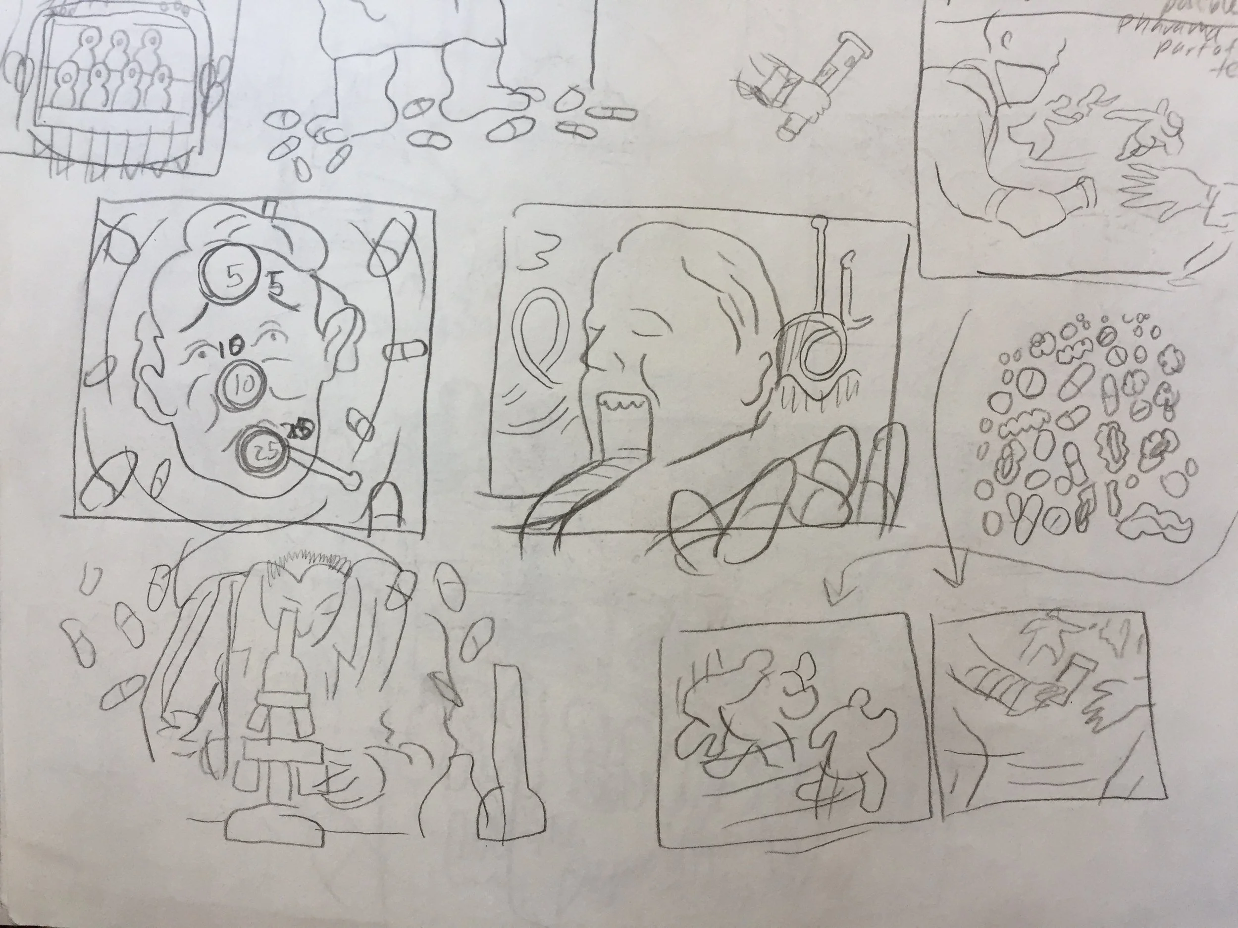
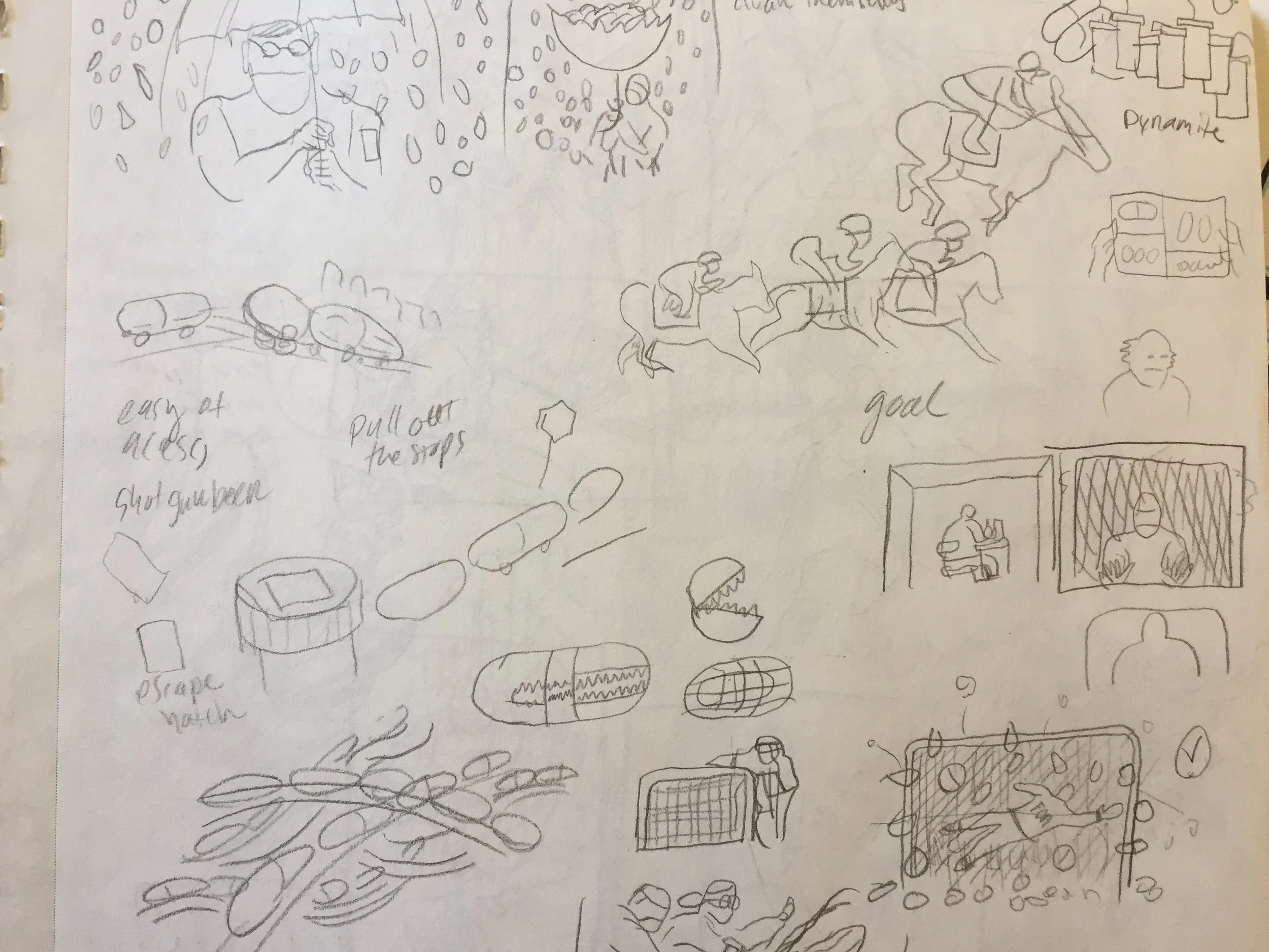
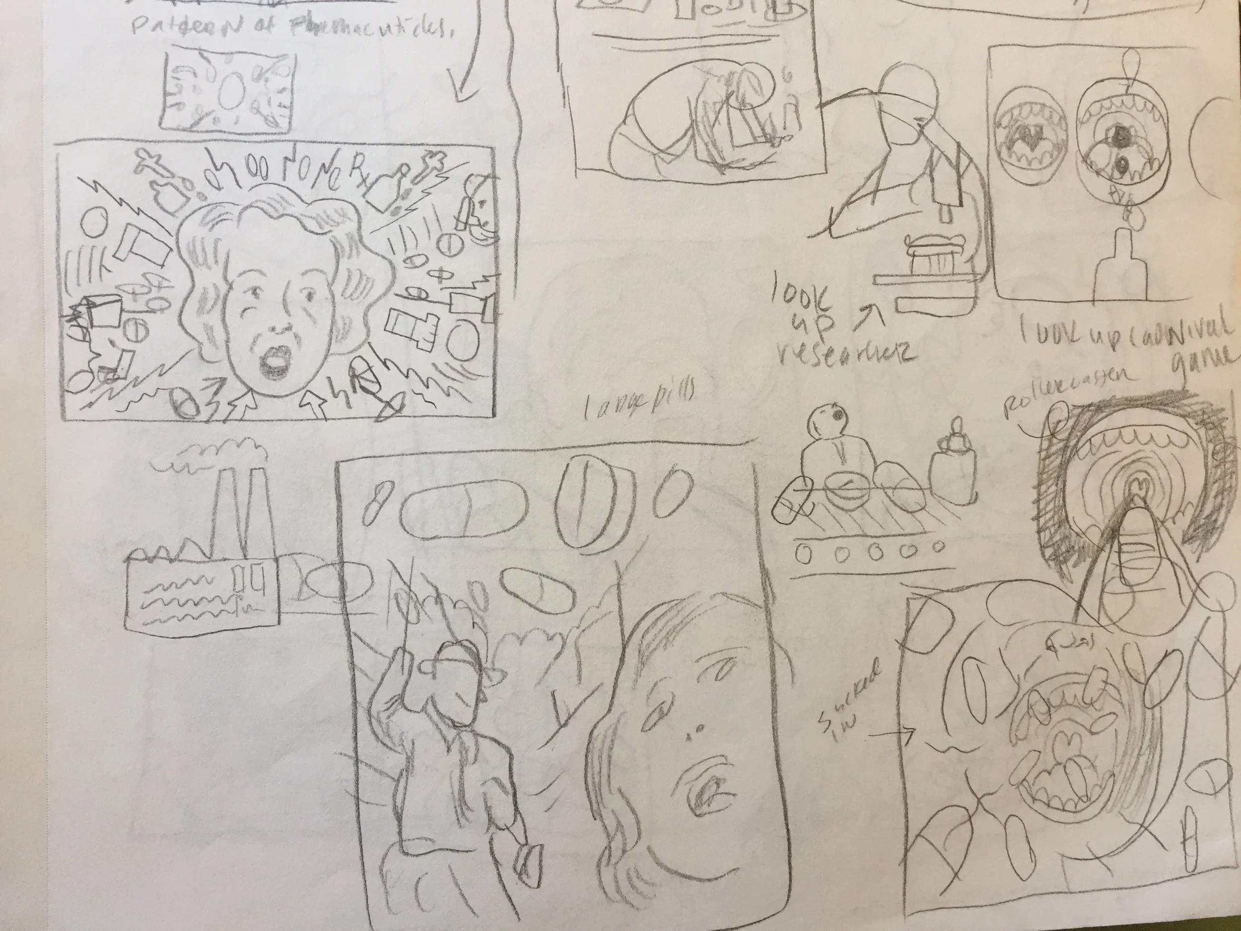
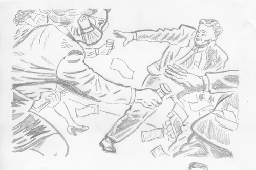
These are some of the pages from my sketchbook for this project. I think I did about 4 or 5 pages of concept sketches. The good ideas usually come about 2 or 3 hours into the project and only sometimes sooner. These are embarrassing as drawings. I mean, look at these! I hope that is encouraging to you. Concept is king at this stage. I don't worry about how they look at this stage. I am only thinking about symbolism. It's almost like a stream of consciousness drawing exercise. I narrow it down to 3 or 4 of the best concepts and then turn those into better (still not good) sketches on my iPad. Trust your instincts here; some of the best pieces I have ever done didn't always make sense if I explained it in words. Also, the art director is there to help. I often judge art directors' ideas when I first hear them because I can be an a-hole, but then those pieces become some of my favorites after I am finished.
FOOTNOTE: About 90% of the time, ideas from the art director have made the piece better and more clear. Trust the art director. They know the magazine better than you. Often, when there is a problem with the direction that you don't agree with ( the other 10%), it's not the AD's fault. It is usually a company/higher ups/ systemic problem and they are just the messenger. "Thou shalt treat thy art director as thyself"- NORMAN ROCKWELL 3:16.
STAGE 2 - CONCEPT
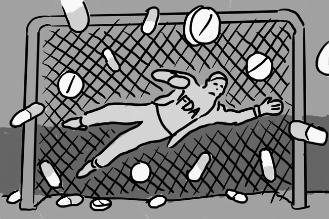
CONCEPT 2 - Goalie can't stop all the pills
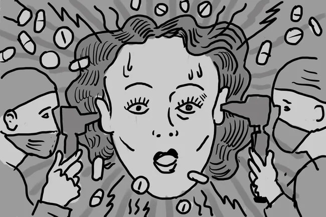
CONCEPT 3 - Woman in medical psychotic trip
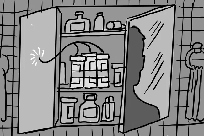
CONCEPT 4 - Pill Bottles are dynamite.
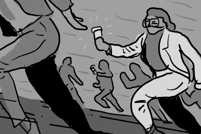
CONCEPT 1 (APPROVED) Marathon runner passing off baton that is a pill bottle.
FEEDBACK:
This concept emphasizes the pressure that the FDA researches are under to approve the medications and deliver the drug to the market. The only feedback the art director had was that she would like to emphasize the frantic rush of the researcher and the greed of the businessman. She suggested adding a briefcase with money flowing out of it.
COMPOSITION:
You will notice in the next stage the first thing I did was flip the composition because I felt like it flowed better. The next thing I did was increase the size of the front two people, making them large and creating more of a focus. You will see later that there are a few more problems with the composition that I have to correct.
STAGE 3 - COLOR PALETTE
I usually try to figure out the color palette right after the concept gets approved. It is probably the hardest step for me and the one I have been trying to grow in the most. It can take anywhere from 1 hr to a whole day for me to decide on color depending on how much time I have. It's mainly difficult for me because of the arbitrary nature of colors. There is no right or wrong, it's just preference. Sticking to complementary colors is a great place to start...and finish.
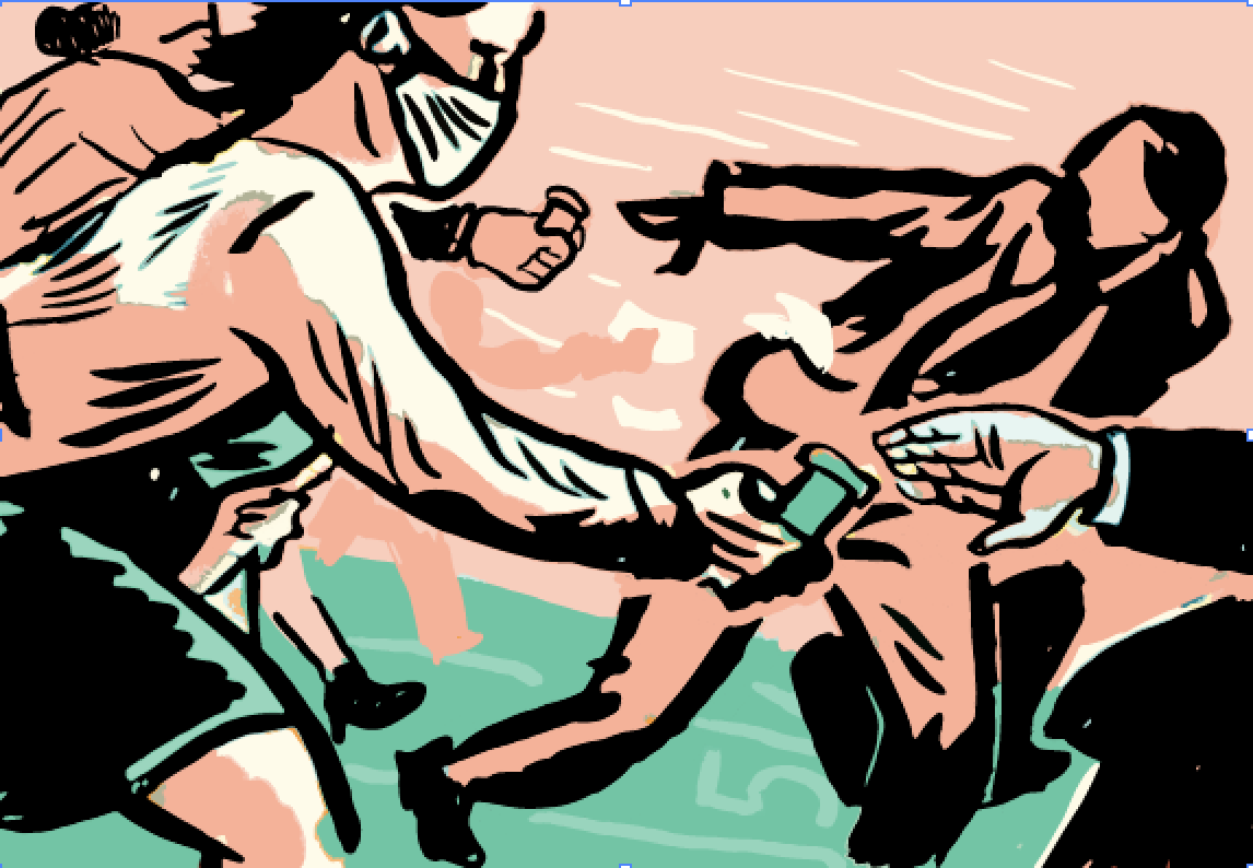
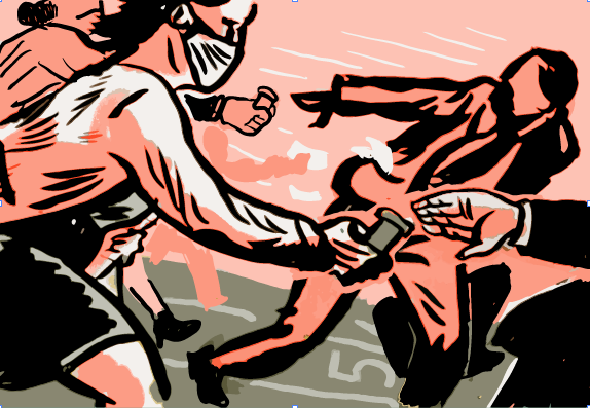
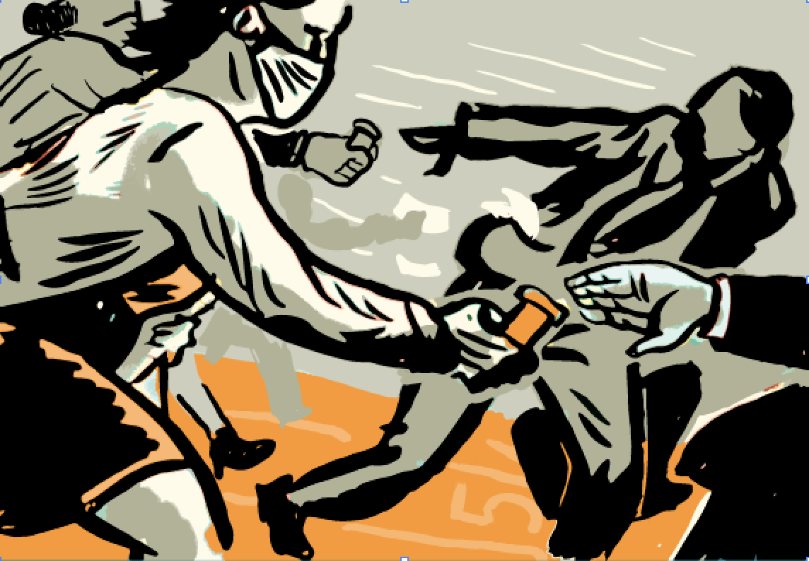
I do this step in photoshop and sometimes illustrator. There is an interesting process in illustrator that I want to show you in the future, but for now know that it is just trial and error. Often, colors you wouldn't think could work together do and vise versa. That is why I like to test lots of different options. The bottom left is the one I went with. I really wanted that medical green/teal since it's a medical piece, and that is probably my favorite color right now. You can download the swatch for photoshop below, or just drag this image into photoshop and eye drop it (you know what I mean).
STAGE 4- RESEARCH AND DEVELOPMENT
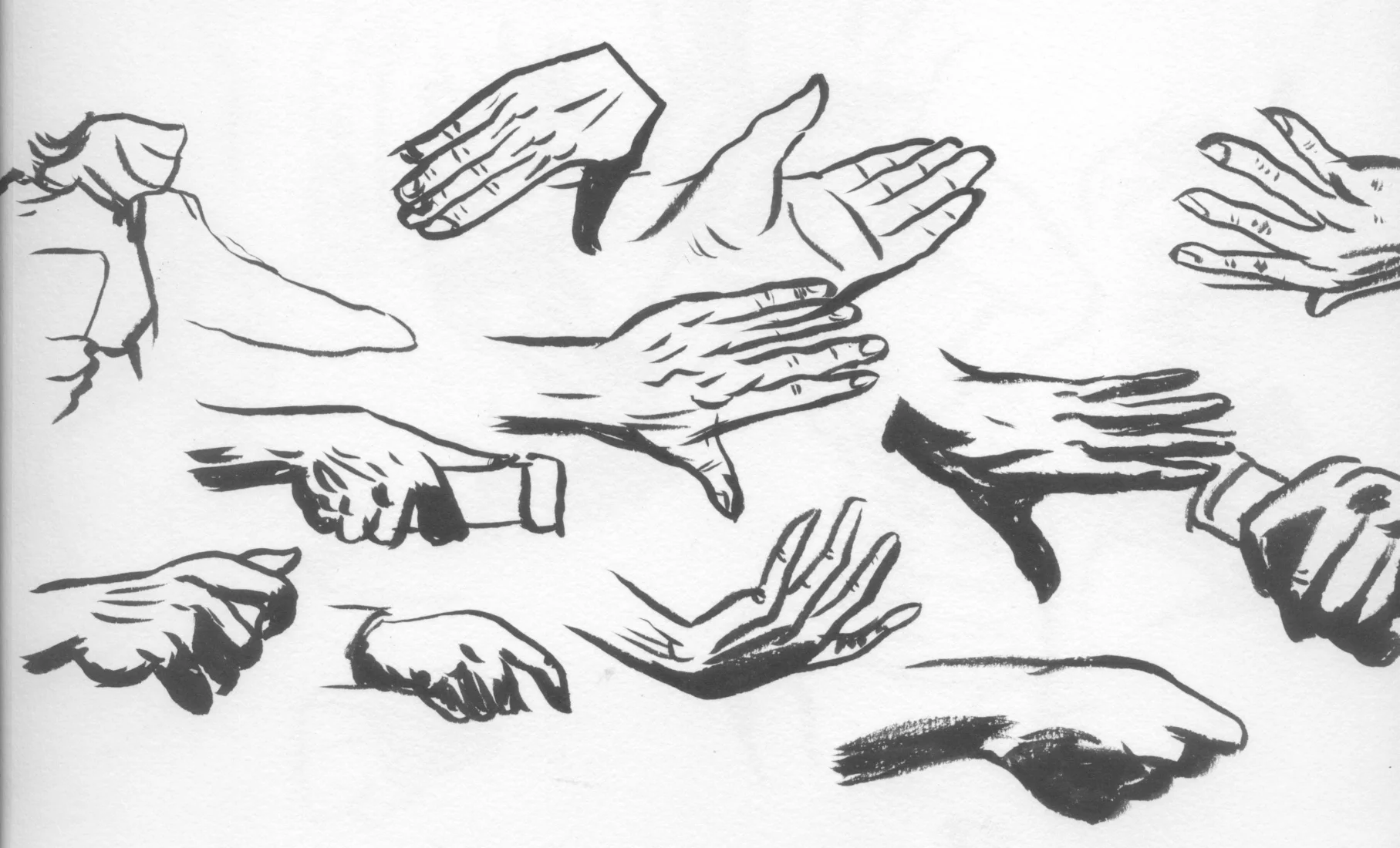
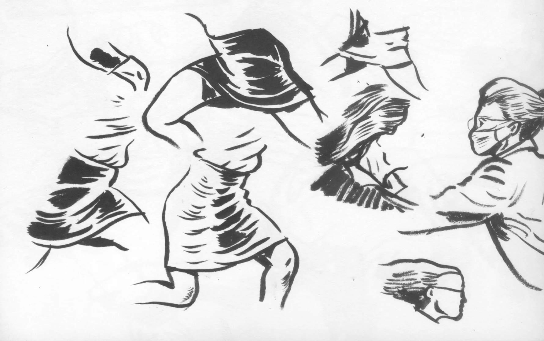
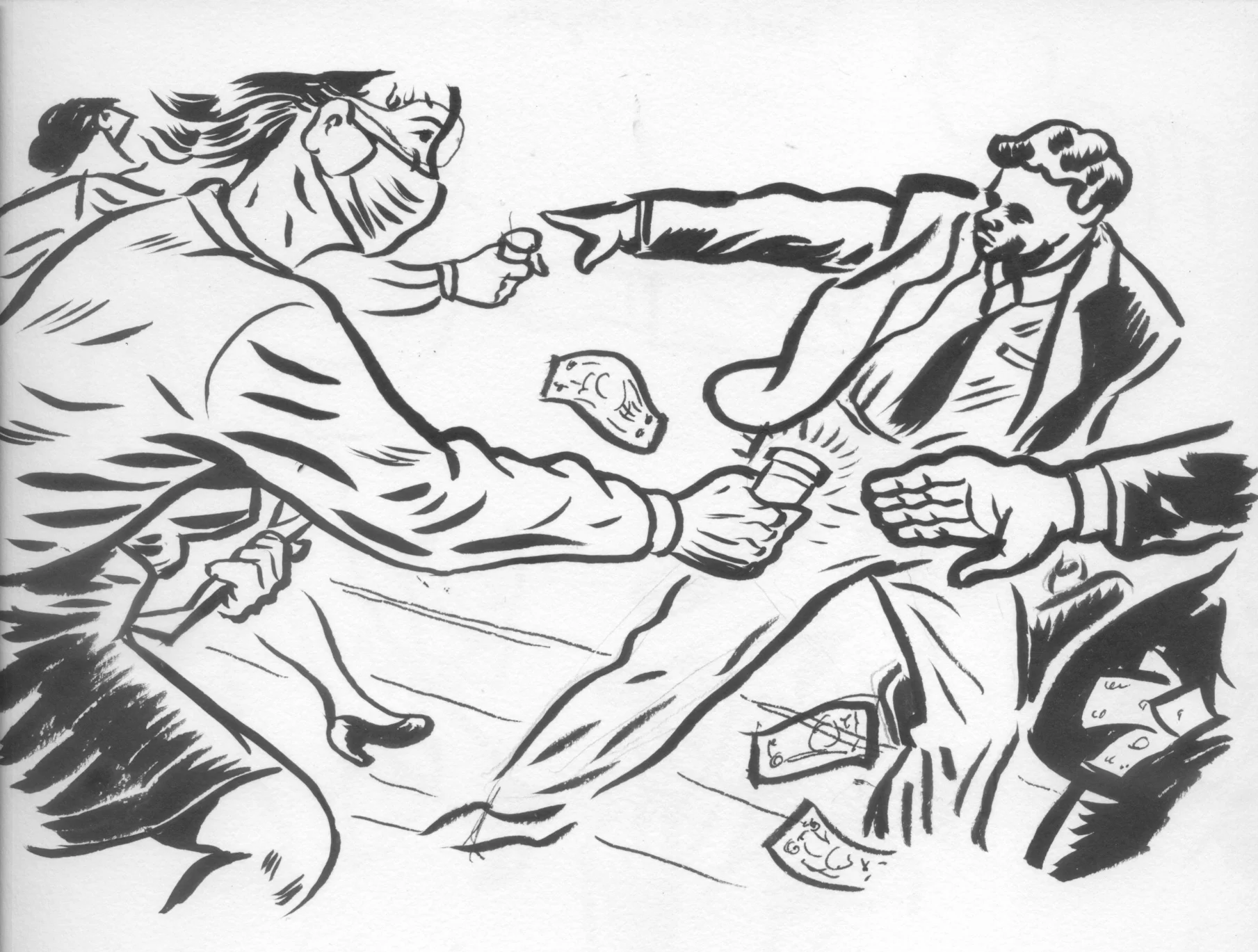
Here you can see the various drawing studies I try to do before I go to the final. This is where I do a lot of research looking at reference photos and trying to find the most interesting and appealing way of rendering something. I use google images for references, although my instinct is telling me that is lazy. Personal photos are the best, but when the deadline is 10 hours away, who can do that? I also play around a lot with composition. This is the stage where I flipped it and expanded the main characters.
I like to keep the subject matter close up and as large as possible. It's just preference and habit, but it works for impact. After I do pencil studies and I feel confident rendering the subject matter, I like to do some quick ink passes without a pre-sketch. Not looking too much at the references, I will try to do a loose ink version of the whole piece. Sometimes this loose version will bring out something new and interesting. Otherwise, it is time to go to the inking stage.
Stage 5 - INKING (CORRECTING COMPOSITION PROBLEMS)
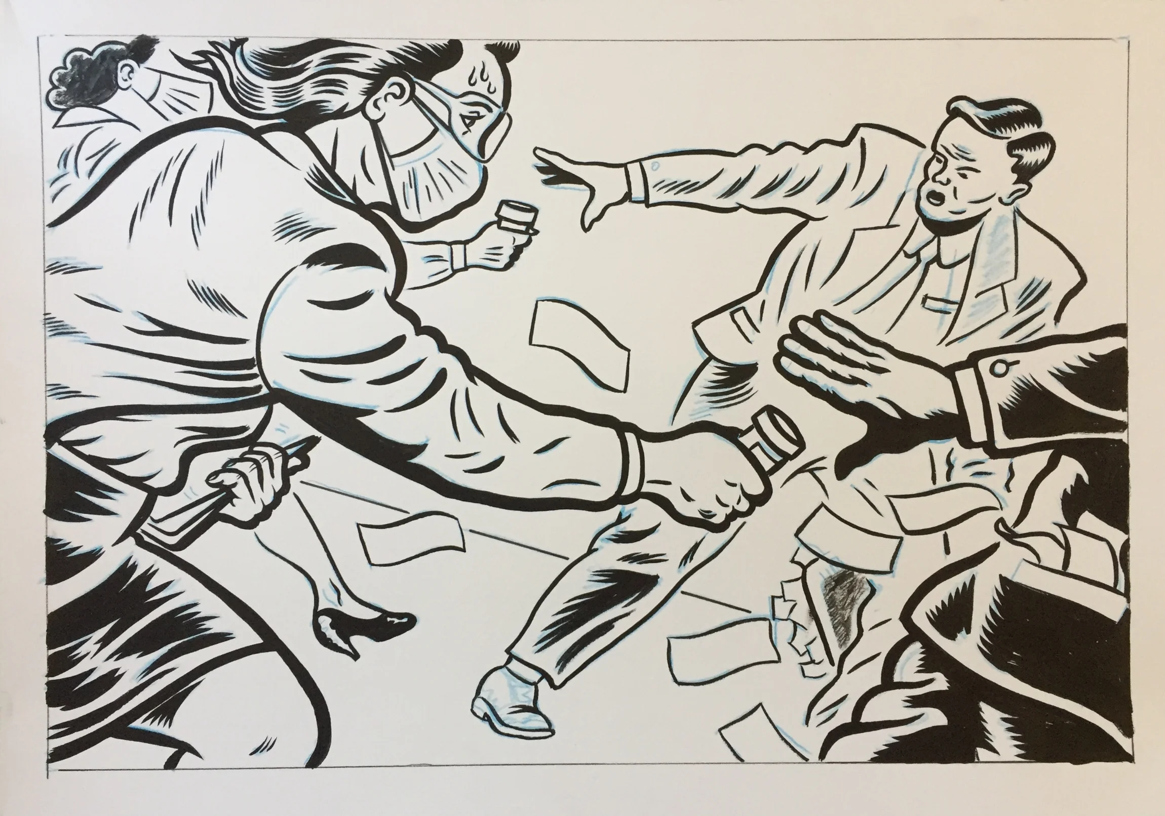
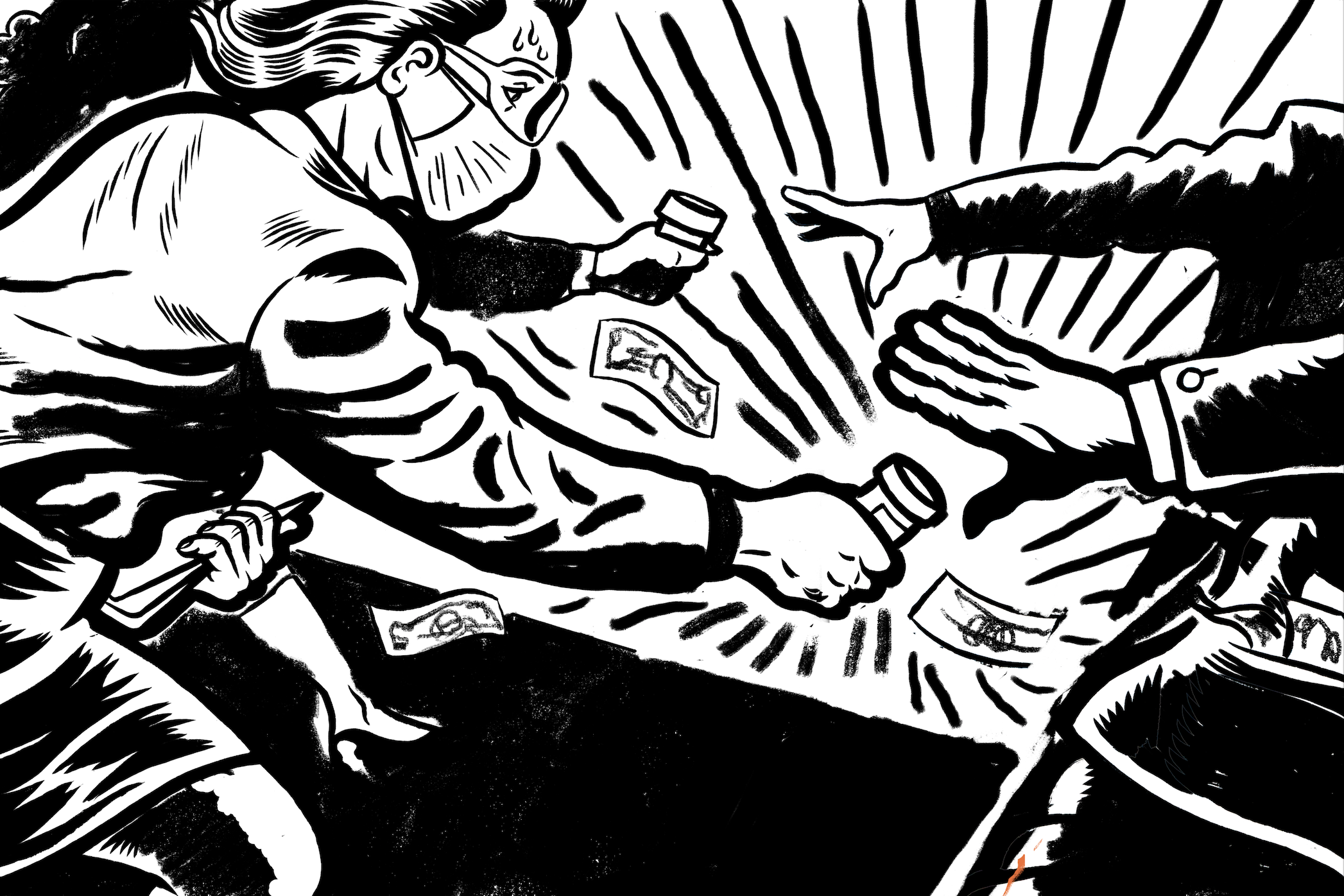
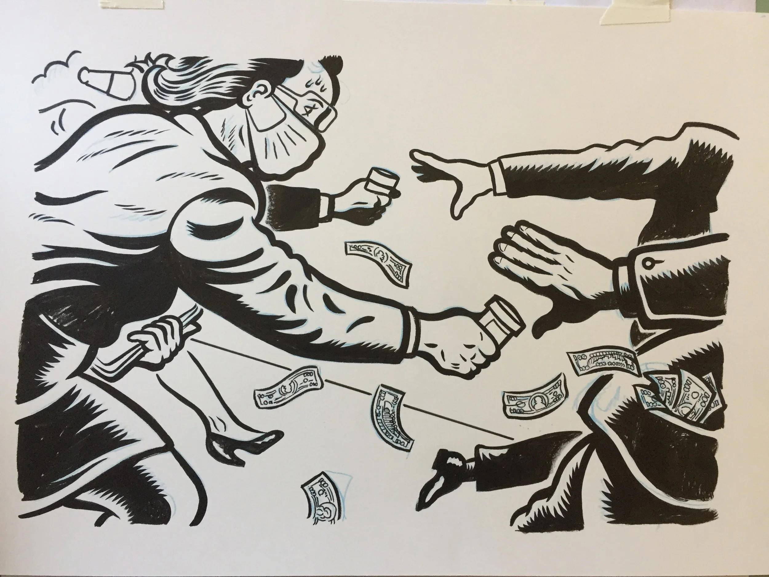
After I did my first pass inking the whole piece, I began coloring the image. Unfortunately the composition suddenly felt unfocused and I needed to make big changes which is a lot harder at this stage. What was the problem? The main focus of the image (the pill bottle handoff) was getting lost, and the man in the background was taking too much attention away from this. Also, look how ugly he is; it's distracting. We need to refocus on the woman and her sweaty brow. I needed to get his face out of frame and make some space around the pill bottle. I also felt like some bursting lines could draw even more attention to the bottle. I added a lot more black around the image to give it weight. What is a successful illustration? To me, it is an image that can direct the eye to the places it needs to go. We need to use every tool necessary to direct the eye towards these spots and away from unimportant details. Below was where I settled after and hour or so of cutting things up and moving them around in photoshop. Here is a sped up video of the 2nd inking pass.
Ok this is fast! I will try to slow down or not move the paper around so much in future videos. My suggestion if you are on a desktop is to set the speed option to .5 or .25 to make it less disorienting. Below is the final inked page. Now to the last step.
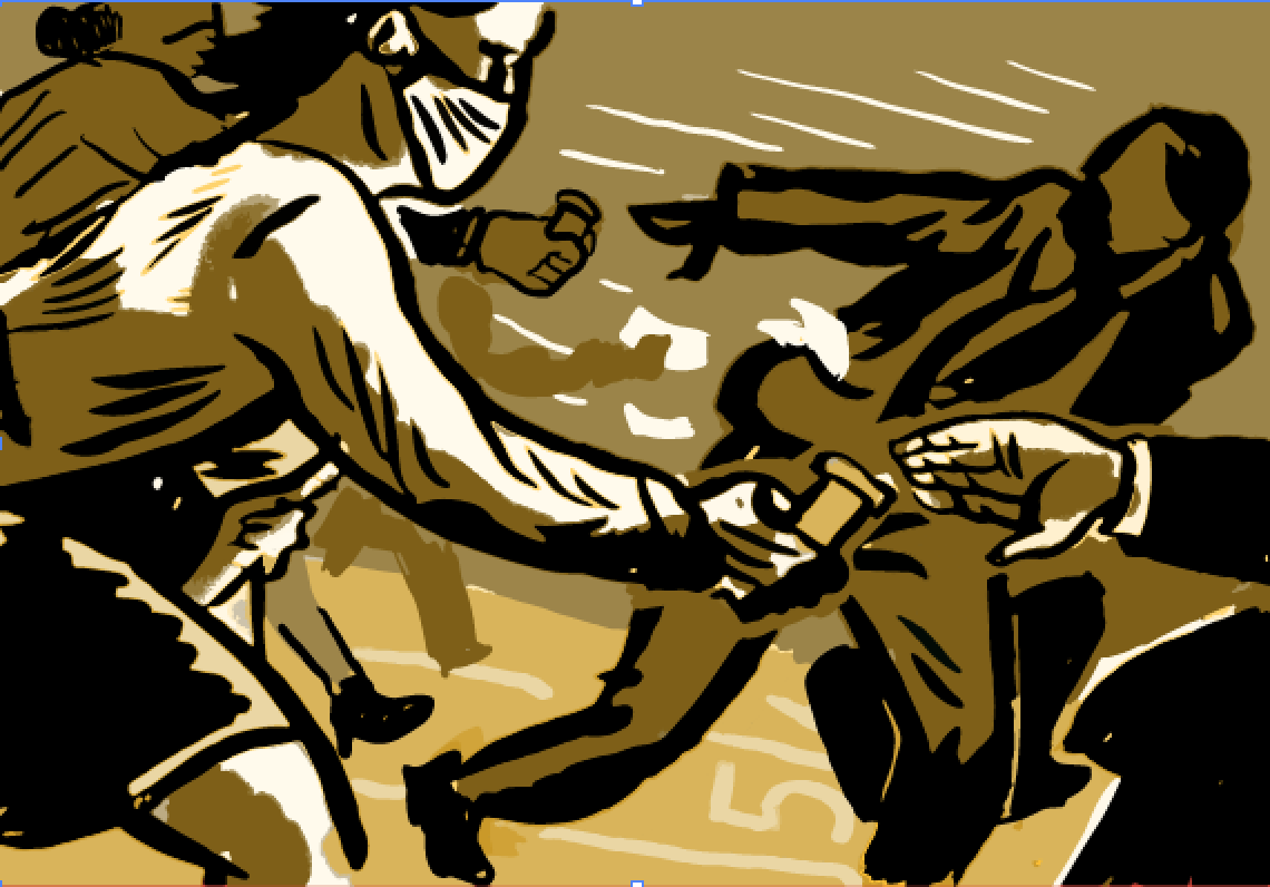
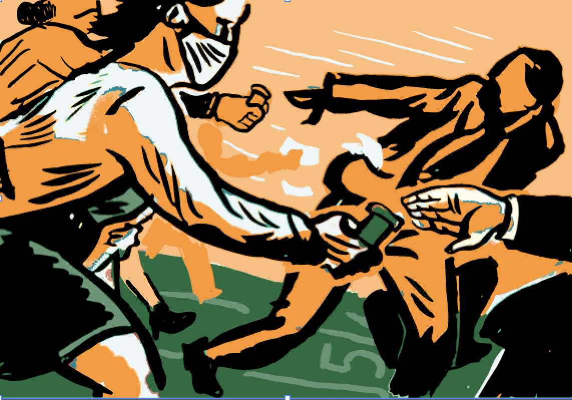
STAGE 6 - FINAL
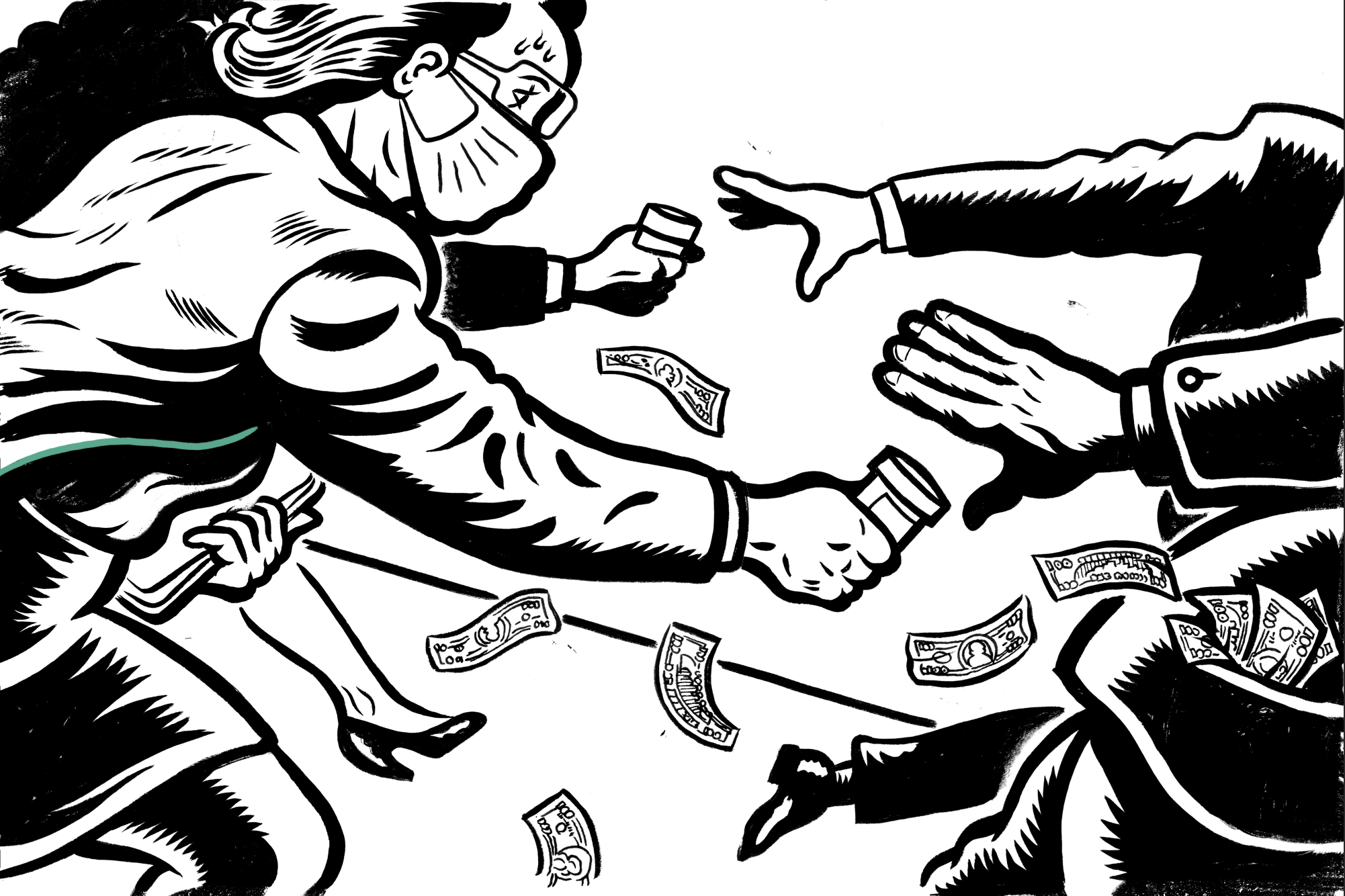
The ink layer is scanned in and adjusted to keep the contrast high. only blacks and whites at this point.
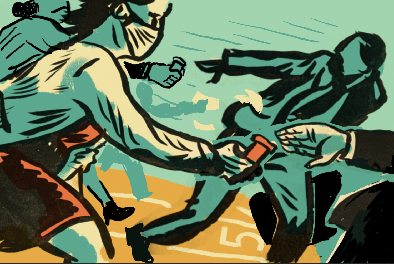
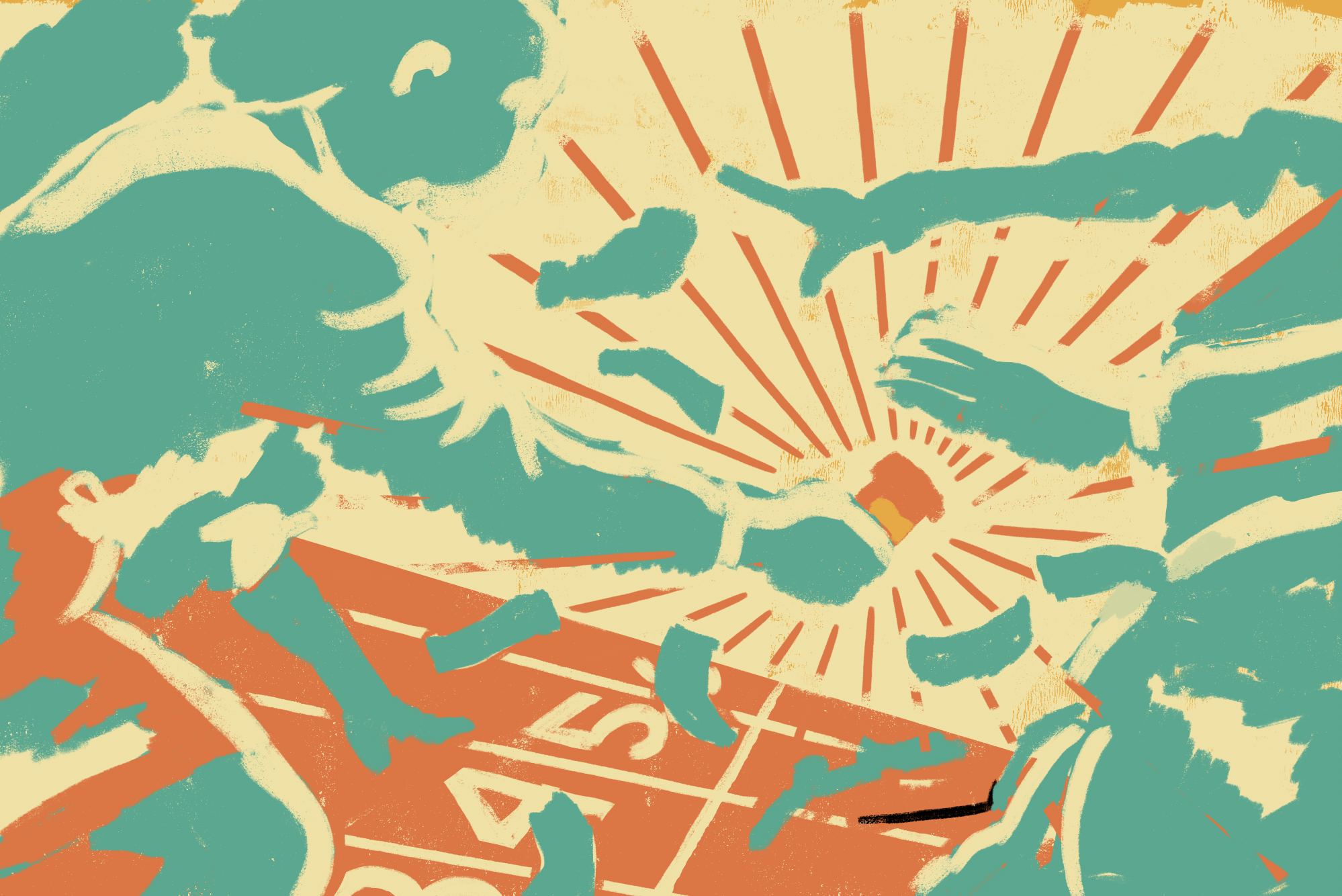
Then the Colors are added to a different layer. Any last minute adjustments are made.
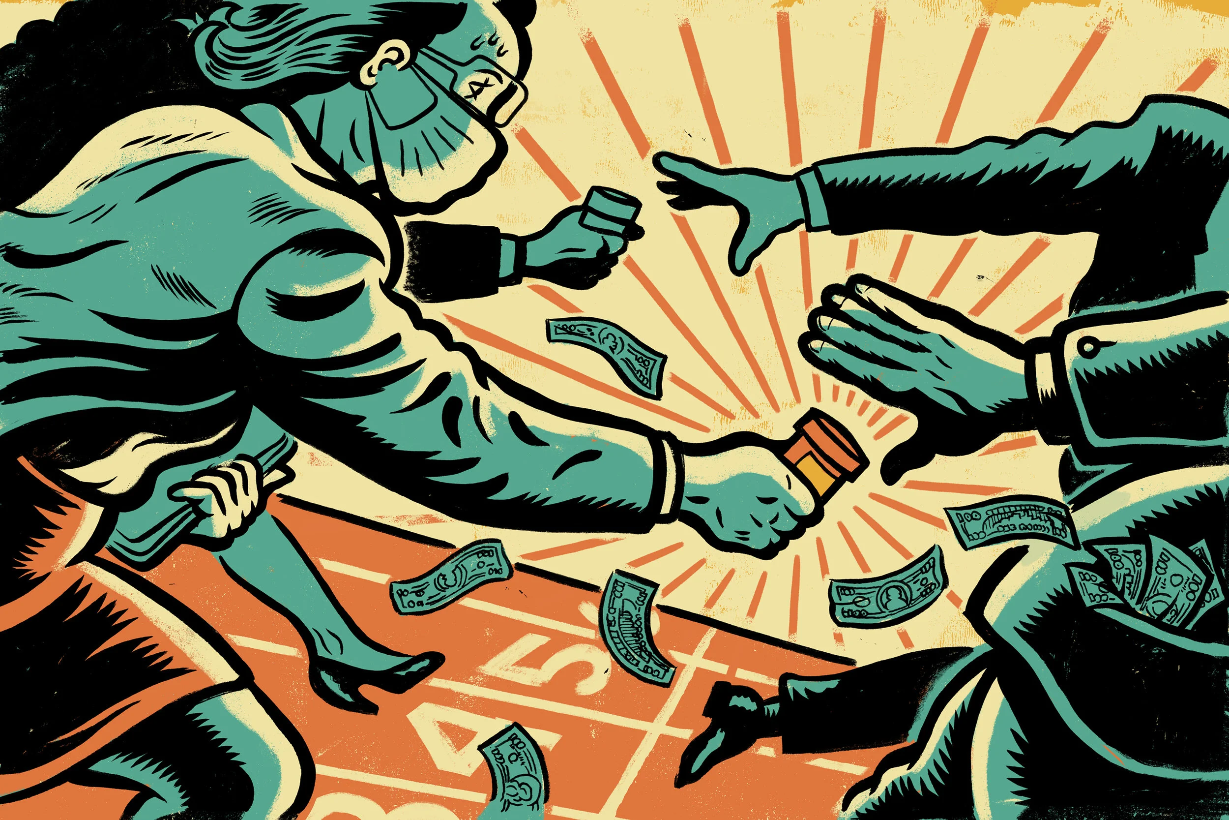
And there you have it. The final image was sent off and approved to everyone's delight. You can see the image in its final home by clicking the button below. The article is a good read, check it out. I hope this gives your creativity something to chew on. I am looking forward to going into more detail on the next issue. If you found any part of this helpful or interesting please consider subscribing and support this idea and my art. Thank you!
THE END
SUBSCRIBE TO RECIEVE FUTURE POSTS
ART GUM Monthly Issue
Monthly Issue + Exclusive Content + 1 Print Every 3 Months
Log in to Change Subscription
