ISSUE 4 - NOV.
In This issue I will be breaking down my process for an editorial Illustration I did for The Hollywood Reporter. There are videos and Comps to illuminate the progress and thinking behind each step. Below is the final image as it was printed. Now, lets begin.
PART 1 : CONCEPTS
ROUGHS
The article for this project was about the Chinese movie industry. The thesis of the article was that China is uncomfortable with images of rich Asians in Hollywood due to the hype around Crazy Rich Asians. China wants to now censor or even remove excessive portrayals of rich Asians. Here are my concepts for the article. All of these are about hiding wealth and censorship. The approved direction is on the right.
EXPLORATION
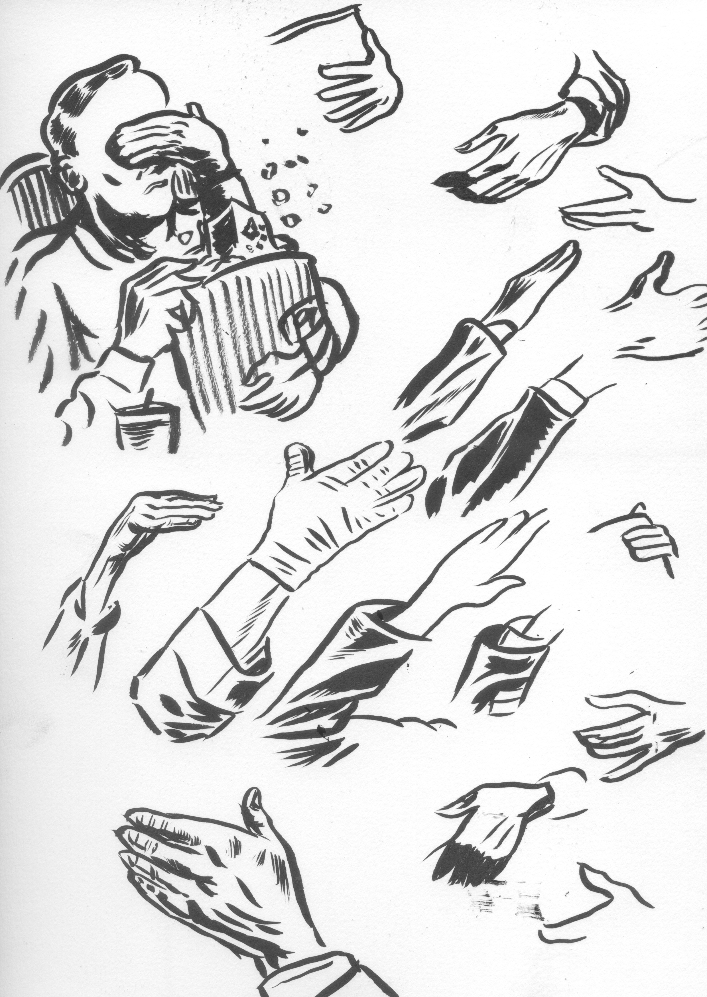
Here are a couple of progress sketches in which I explore and research different ways of showing a person in a movie theater. The hands were giving me trouble as usual, its hard to make a hand look natural especially when it is bent the way it is here. Also I flipped the composition of the piece the other way because I started to think it was more impactful that way. It flows better I think.
PART 2 : COLOR
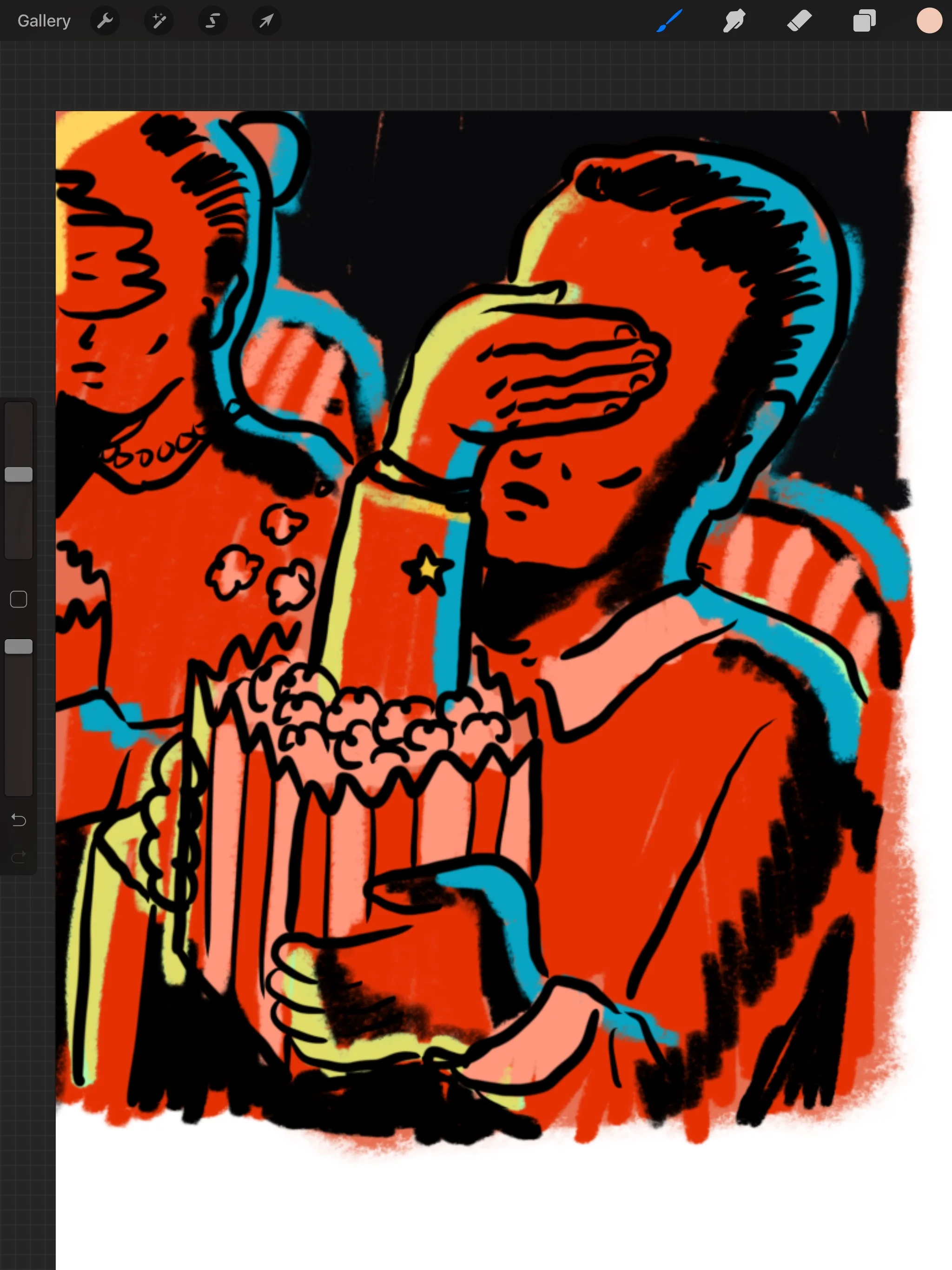
I liked the color on this photograph and decided early on that I wanted the theater to be dark and dramatic. I used the blue yellow red combo and wanted the blue and yellow to be a highlight/reflective color. I also wanted Red and yellow to be the main color here since it is a story about China. Also when a composition has a lot of black it seems that a little bit of bright color goes a long way. You will see later that I moved the colors around after the image progresses some.
PART 3: INK
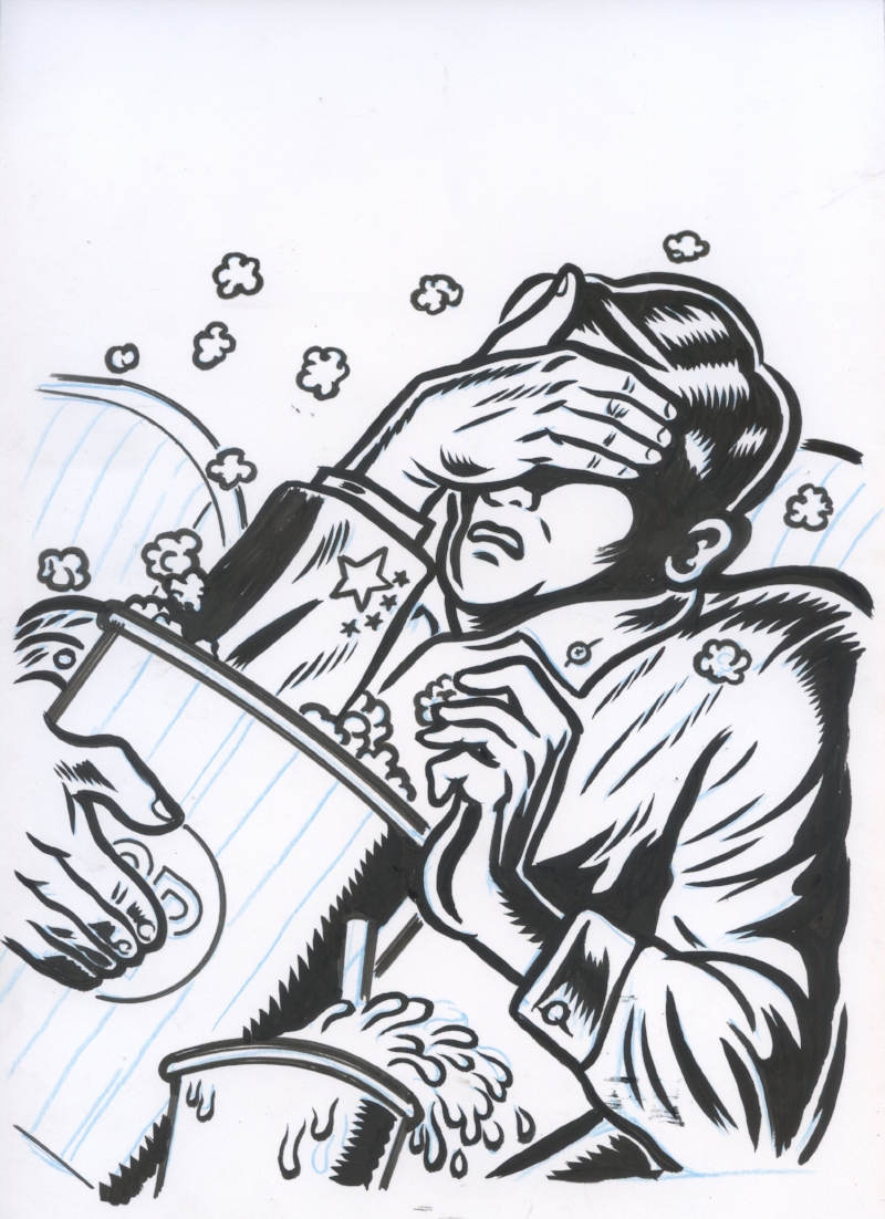
Here is my inking of the earlier sketch. I struggled with the angle of the image and even tried making it straight on at one point. I really liked this angle because it has more movement to it and the image should be in motion and impactful since the topic is aggressive. This is my favorite part of any project.
INK FINALS
If you take a look at the difference between these two images you will see that I went back later and added a lot more black to the image. This was to emphasize the light on the side of the movie screen and for some reason I felt like it made the image more dramatic. I hope that is the case but I can’t tell now.
PART 3: DIGITAL
After scanning this in I start to color it. It starts off pretty straight forward but you will see that I end up playing around a lot with he color at the end. It is not Idea to change anything at this point but color is the last chance I have to improve the piece if it doesn’t quite feel right.
So the last change I made was to make the left side’s reflective coloring bright white and put the yellow on the inside tone, since white is brighter, this made more since. Also I darkened the skin tone which brought out the reflective (highlight) color on the left.
FINAL
THE END
Thank you for subscribing and supporting my art. I hope you are getting something of value out of this. If you have any feedback to help me make this better, more of this less of that, please let me know in the form below. Also, if you have a question about something you want to learn more about please enter that below as well and I will try to answer it in a future issue. Or just say Hi!
If you find this useful or interesting please share it with someone who you think would also enjoy this. You can pass them this link: http://www.curtmerlo.com/artgum
I really appreciate it!


