ISSUE 3 - OCT.
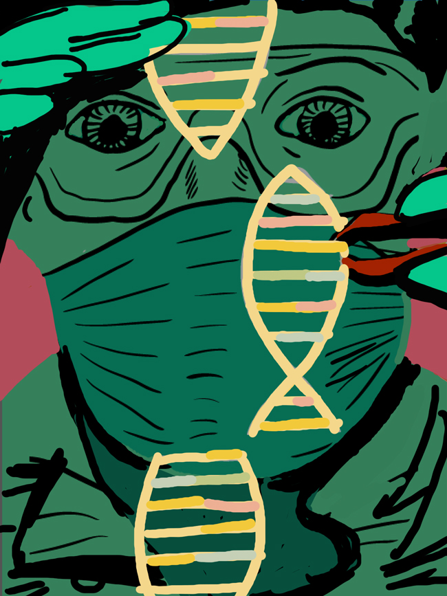
In this issue, I am going to break down an editorial project I did for Indianapolis Monthly about a month ago. You will see me go through the process of a normal editorial illustration, but this time I had to correct a lot of compositional problems I discovered after I was well on my way. I had to redo a lot of the image to make the piece more efficient and focused. You can see the final Image below.
PART 1 : CONCEPTS
The article was about the first genetically modified fish and how it is raising a lot of eyebrows and causing much debate over its existence. There are a couple of different directions I could see this image going in, and I eventually found the focus to be the DNA and research that has gone into making this fish possible. The concept to the far right was the one they chose.
ROUGHS
EXPLORATION
You can see here some explorative sketches. On the left, I was working out how to incorporate the face and hand. I wanted to emphasize the science/research of it, so I wanted a medical mask and protective goggles. In the middle are some reference drawings of the hand. This was going to be an important part of the image since it is the foreground. On the right is an updated value sketch of the concept. It ended up being the on I used to ink.
PART 2 : FIRST EXECUTION
Below and to the far left is the composition in full color. I wanted to make sure that the fish symbol popped. The best way I thought to do that was by making the background, including the figure, dark and the DNA a bright/ light color. The colors were ok here and seemed to achieve its purpose, but I couldn’t spend more time on this than I already had, so I moved on to the inking stage. I decided to work out whatever it was that wasn’t sitting right with me later (sometimes that works but not in this case), so I moved on. The middle image is the final inked image and the right was my first pass. You can watch me complete this process in the video below.
The piece turned out precisely how I envisioned it in the composition/exploration phase, but there were massive problems with the design. I had trouble identifying what was going wrong but the first thing I noticed was the colors were not right. I recolored it (which you will see next) with the exact opposite hierarchy. The DNA wasn’t working as the light value, so it ended up making it brighter and darker. Also there is a strange open space where the DNA is being taken out and all you can see there is the researcher’s mask. It became apparent to me that this space was a big focus of the piece since the eye naturally travels to that open space, but it was being wasted on something unimportant (his mask). In the next execution you will see my new colors and the new composition where I address these problems.
PART 3: SECOND EXECUTION
NEW COMPOSITION
This is the new composition. The background colors are brighter but the foreground still stands out as the focus. The researcher’s eye is now in the happy opening where the fish DNA used to be. This creates a more efficient use of space and the image hierarchy. Now all the important parts of the image are sitting nicely in the center of the image and the less important details are all on the outside. The image feels more focused and easy on the eyes.
INKING 2ND PASS
Below is the final inked page. Much better composition even though there is still much work to be done.
DIGITAL COLOR AND DETAIL
You can see in the video below how I worked out some of the composition on screen and moved some things around to add detail. I had to still keep the image simplified and focused as this is a big concern of mine for any image. This is not easy when the piece is only 6 inches tall. I had to illuminate a few things, but luckily it came together well in the end. I often question when I have crossed over into over-working territory. I could have stopped so many times along the way, but ultimately I needed to feel like I have worked out all the issues that are taking value or clarity away from the piece. This is the only way I know how to do that right now. Just work and rework something until it feels right.
FINAL
I am really happy with he final, as it feels balanced in color and in focus. There were so many different ways to handle this, but I felt like this was what presented itself to me in the end.
THE END
Thank you for subscribing and supporting my art. I hope you are getting something of value out of this. If you have any feedback to help me make this better, more of this less of that, please let me know in the form below. Also, if you have a question about something you want to learn more about please enter that below as well and I will try to answer it in a future issue. Or just say Hi!
If you find this useful or interesting please share it with someone who you think would also enjoy this. You can pass them this link: http://www.curtmerlo.com/artgum
I really appreciate it!


