ISSUE 2 - SEPT.
In this issue we are going to look at a recent project I did making a matchbook for a cool Cold War bar in Oklahoma City called "Bunker Club". Below is the final product. I got this gig because I saw some cool matchbooks recently and wanted to make my own. After posting about it online, the bar approached me asking me if I could make one for them. The best projects I have ever gotten have come from curiously following my interests. I will post a link at the end where you can see the matchbooks I made that started this project.
PART 1 : CONCEPTS
INSPIRATION
The bar owners requested a Space Race theme, so my inspirations for this project were Space Race matchbooks and stamps from the Soviet area. Who wouldn't love these wonderful cosmonauts. Also, I wanted to to include a pinup model in space and how could I not include Laika, the first dog in space.
ROUGHS
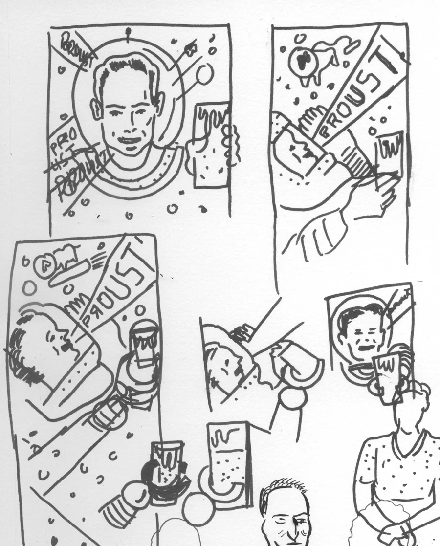
My basic Idea came pretty fast once I identified my inspiration. You can see my sketchbook pages below.
COMPOSITION
I scan these sketch pages into photoshop and move them around until I find a layout that works. Below is the layout I settled on. I broke it up into 3 sections and treated each one separately, even though there are only two sides to a matchbook. I thought it would be easier to think about it that way. By the way, I don't know what proust means, but I heard it somewhere and thought it meant cheers in Russian. It doesn't. Now that I have the basic layout figured out, I will print this out at 200% and trace it in non-photo blue pencil onto Strathmore smooth Bristol paper ( to the right) before I ink it.
PART 2 : INKING
Below you will see a series of videos in which you can watch me ink the actual illustration boards for this project. Some days I feel really fluid and loose, and other days it is rigid and tight and the result are not as good. I don't always know why, but to the right are some tips that I have found to help me when I don't feel loose. It's ok to use a white medium to blot out mistakes. I use white gouache but there are a number of options, you just need to make sure you can ink over the white material.
TIPS
1. Make sure your brush is clean. Clean it every 20 dips or so.
2. Turn off any fans that may be circulating air over the paper.
3. Steady fluid strokes are better than short slow ones.
4. Only pull the brush in one direction, never push it.
5. Make sure to do a 30 to 50 warm up strokes.
BACK
FRONT
INSIDE
Finished inked boards
Stage 3: Digital Enhancement and Color
First, a note about color. I started out thinking this piece would be blue and red, but as the piece develops you will see that I made the decision to keep it monochromatic blue and tan. The reason I cut out the red was it became ever apparent to me as I was working on this that matchbooks are really small and the more color I added the less my eye was directed and got lost. When I simplified the color palette, suddenly the whole thing seemed to work and it relaxed my eye instead of confusing it. Even though it was hard to cut out the red, I am alway trying to serve the project and be willing to cut out even what I feel is necessary. If it makes the finished art more effective, I have to do it. Now enjoy the show.
FRONT
BACK
FINAL
This is what I turned in and although they haven't been made yet I am really excited to see them. I will post them on my instagram when I see them.
You can see the matchbooks that I made that got me this project as part of the funpack HERE in my online store.
THE END
Thank you for subscribing and supporting my art. I hope you are getting something of value out of this. If you have any feedback to help me make this better, more of this less of that, please let me know in the form below. Also, if you have a question about something you want to learn more about please enter that below as well and I will try to answer it in a future issue. Or just say Hi!
If you find this useful or interesting please share it with someone who you think would also enjoy this. You can pass them this link: http://www.curtmerlo.com/artgum
I really appreciate it!


